- cross-posted to:
- animation@lemm.ee
- movies@lemm.ee
- cross-posted to:
- animation@lemm.ee
- movies@lemm.ee
I’m not a fan of this rotoscope looking CGI animation that seems to be so popular. All of the characters always seem too crisp and “on model”. There’s no room for artistically blending characters into shadow.
I suppose a faithful Watchmen cartoon is fine as a way to show it to people who wouldn’t read the comic, but given the choice between the two this looks like it falls short.
I agree. The best thing I can say about this is that it’s just like watching the comic book.
Which is fun, except that the comic book already exists and it’s great. If people want to watch a movie instead the Zack Snyder flick is fine and at least keeps it somewhat original.
It’s fun enough to see, but more than anything it just feels unnecessary.
I don’t mean to spew too much (but I will), but this animation really loses something compared to the comic.
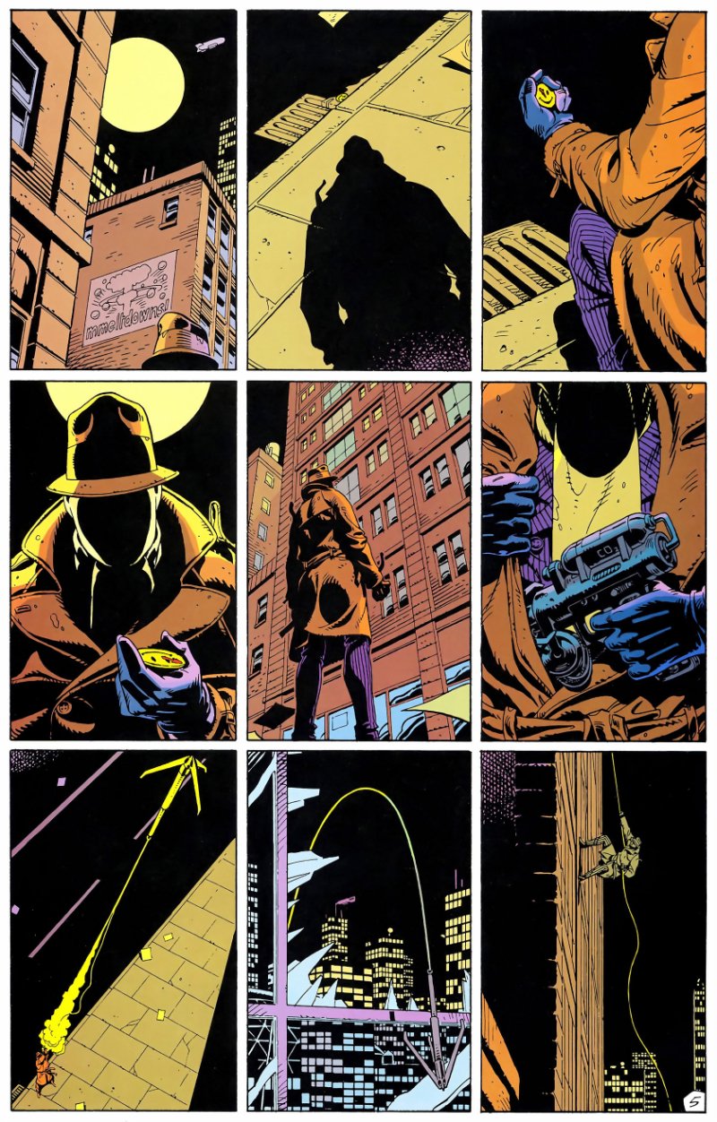
Look at this page of Rorschach ziplining up the building.

The 9 panel layout gives this great visual story telling. Look at things like the buildings in the top left panel, how there is no outline just windows to give the impression of an outline. In the middle left panel, the details of Rorschach’s mask and chest have been deliberately minimized with specifically chosen heavy shadows- unlike taking a 3D model and casting a computer calculated shadow on it. The building in the middle panel is drawn to ensure it really feels looming.
Etc, etc. There is so much thought put into the layout, angles, colors, and forms in the drawn comic that make it so top tier.
It’s possible to make a cartoon movie that captures that, but you’d really have to get some quality artists and directors (and give them actual artistic freedom) to not just be technically proficient but make solid artistic choices.
Excellent reminder of how amazing the comic book looks. And how incredibly dull this trailer looks by comparison.
I’m not so sure the same visual style can be captured well in a cartoon movie - the flat colours and high contrast visuals would probably look funky in motion. Happy to be proven wrong though!
Edit: I guess in a way it has already been done with the motion comic. Looks better than the new movie for sure, but lacks the impact of the comic strip in my opinion.
Yeah, I really hate these. It looks like the cutscene of some fighting game, stilted and soulless. I’m sure they put a lot of heart and effort into it, but I don’t feel it unfortunately.
Huh. Not really impressed with the voice acting or the heavy focus on Rorschach for the trailer. He was a main character, not the main character.
Disappointing.
The trailer is, to its credit, doing some decent misdirection so the whole plot isn’t given away. Rorschach as a noir detective is a decent hook for people who don’t know about Watchmen and you can show a lot of snippets of that without spoiling much.
If I remember correctly he’s also kind of the narrator in the book - we follow other characters as well, but Rorschach is the one taking the active role of narrating the universe through his diary entries or whatever. Makes his voice an obvious hook for a trailer.
WTF. It’s literally the movie again. This seems extremely uninteresting. huge pass from me. I’ll stick to the movie and the watchmen mini series.
It seems to be based on the book, not the film.
Which is what the movie is based off of, and did a pretty decent job. There’s such a lot that can be done in their universe, yet the corpos decide to just squeeze out as much money through remakes.
DC’s gonna DC. 🤷♂️
Even though it looks like the comic ➡️ live action ➡️ animation, I’ll still give it a shot. At least they’ve spent more time on this than there usual straight to video stuff, which to me, looks cheap.
Meh.
Uhh, the comedian* wasn’t a superhero. He was a vigilante. They were all vigilantes, except Dr manhattan


