I really liked this cover for Thunder Castle. Never even heard of the game but this is the type of fantasy art I crave. Gameplay doesnt look too bad either!
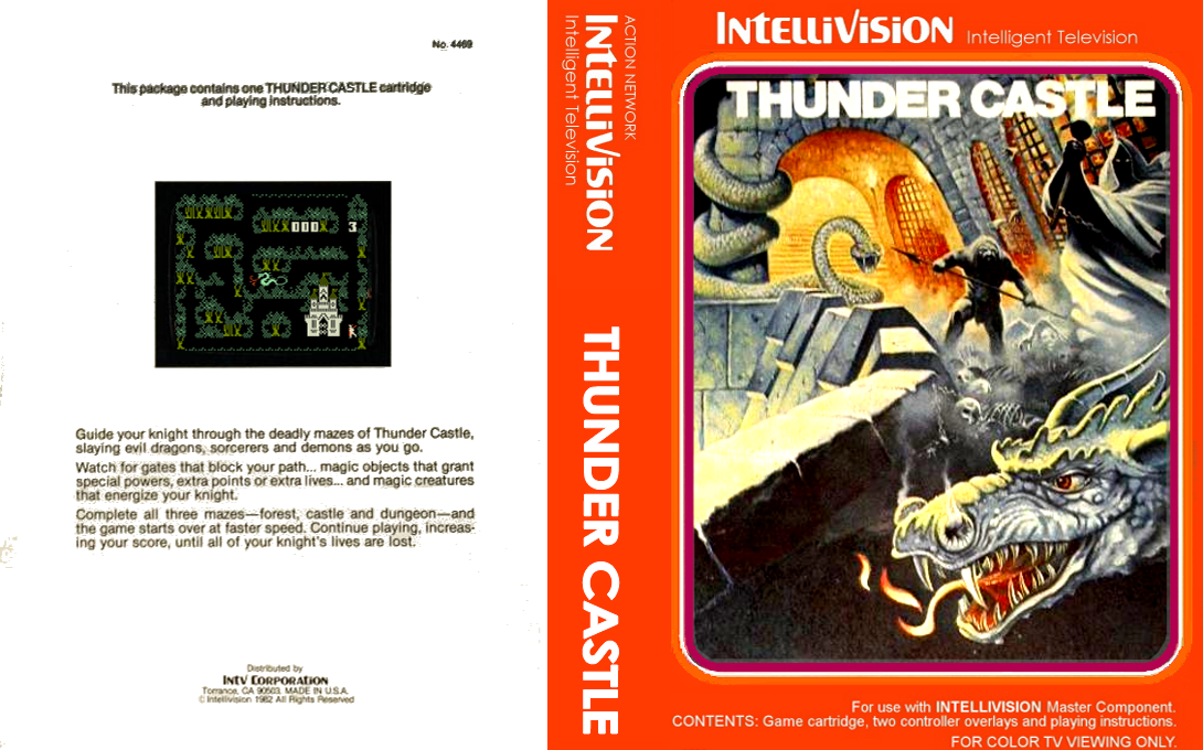
Shit site on mobile. The column of social media buttons floating on the right covers the most important parts of the art.
I was thinking the same thing, how annoying
There was room for a row at the bottom too that wouldn’t block the middle area view, I don’t know css extremely well but I figured they could put that row horizontal down there without much hassle and give a better view. Of course then you don’t get reminded to click on a social link, ugh.
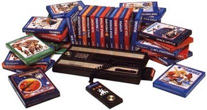
Awesome find. When I was a kid in the 90s I found an Intellivision with 30 games at a yard sale and bought it for $5. This was one of my most prized possessions. I wish I still had it today.
I’ll sell you mine
Mattel really did have great box art. Shit controllers, but great cover art and decent graphics for the time. I remember when my buddy got the voice module and B17 Bomber. When that thing talked, it was like magic.
Ancient games - Atari and Intellivision - had amazing cover art because the graphics were blocks lol. It’s interesting as the 80s progresses and game fidelity started getting better that box art (LOOKING AT YOU MEGAMAN SHIT-SQUAT COVER DUDE) often got worse somehow…
I love the art from Super Breakout - that astronaut’s expression is like “fuck more space blocks, I need a break from this shit!”
That website you linked also hosts ton of roms and complete romsets for every possibly system.
Wow, very nice. These will look great with Launchbox’s 3D boxes.
I too immediately thought to check the LaunchBox Database lol
