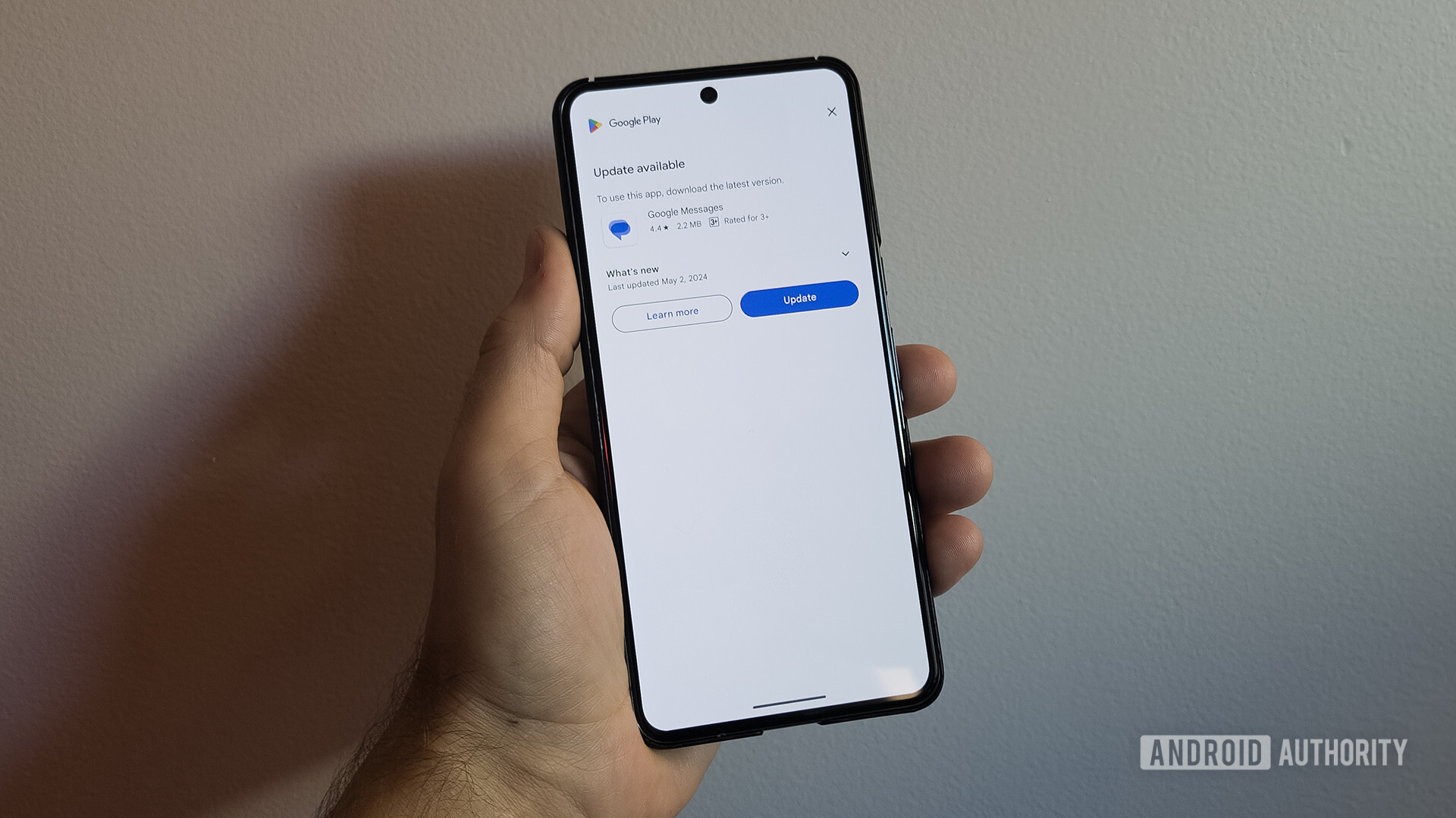
There’s a new Google Messages update page that takes up your phone’s entire display every time you open the app.
Granted, keeping your apps up to date is important, and this new system will help get that across to users. But we’re not sure annoying the hell out of the user about it is the best strategy.


Are there any other options? I’m assuming that this only occurs in the situation where automatically updating didn’t work out?
A persistent banner asking to update at the bottom of the search bar is a good idea. Barring access to an essential app under any condition is just bad UX.