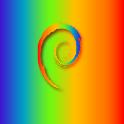
Personally I think it is too blocky and the colors too random, but I don’t know the original comment that gave the inspiration. I like much more, although I’d rather see the rainbow colors follow the direction of the swirl more.
I just searched for “Debian Rainbow” in an image search. I’m sure you can easily hack something together with a rainbow gradient mask over the regular logo in an image editor.
Personally I think it is too blocky and the colors too random, but I don’t know the original comment that gave the inspiration. I like much more, although I’d rather see the rainbow colors follow the direction of the swirl more.
It’s the disk usage analyzer.
Ah, I’m not using Gnome.
Haha no worries. I should really explore other desktops. I have been on gnome for like 20 years :|
I was hoping to find something exactly like this, but I didn’t - what I used was the Debian Diversity logo from their own site.
I just searched for “Debian Rainbow” in an image search. I’m sure you can easily hack something together with a rainbow gradient mask over the regular logo in an image editor.
Interesting, to me, the dual gradient looks like late 90s WordArt lol
I was more talking about the logo itself, not the background.
Ah, yeah fair enough.