

- cross-posted to:
- linux@programming.dev
- cross-posted to:
- linux@programming.dev
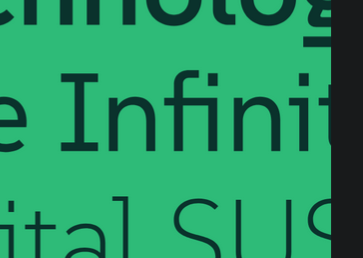
SUSE just open-sourced a typeface :)
You must log in or register to comment.
Already in the AUR as otf-suse and ttf-suse. :)
Silly question: what’s the difference between the otf and ttf fonts?
Edit: thanks for the explainers!
As far as I understand it, TTFs are more basic, while OTF can have more features and glyphs.
OTF is a modern extended version of TTF, with more features. Downsides are it can be bigger in filesize and could even take longer to load. But that is not really relevant for modern computing and one should default to OTF, unless there is a good reason to use TTF variant (if both are available).
Sounds like it, yeah.
https://en.wikipedia.org/wiki/TrueType
https://en.wikipedia.org/wiki/OpenType
no dotted zeroes = no terminal use
I don’t think this font was designed for the terminal. It’s a sans font with some inspiration from monospace styling, but with focus of brand recognition and usage in headlines or text. That’s what I’m getting here. Similar to what Ubuntu does with their font.
I don’t see a monospaced version anyway
Not a fan of semi-serif fonts, and not digging the rounded “corners” on E and L (while having sharp ones in lowercase L and lowercase i), but it seems it is trying to be highly readable so indeed it should be great for UI stuff. And doing a complete typeface covering such huge character map is no easy job.
I like it. Not gonna nitpick. It’s nicer than those microsoft fonts that came out recently
I don’t understand how that hybrid is supposed to work. Monospace is a binary attribute; either all chars have the same width or not. So what is the font now?
It says that it s “inspired” by monospaced fonts. I imagine they mean stuff like the tiny serif on the lowercase
iThis
That’s a great question, on the face of it I can’t find very much info online. Wikipedia has an entry for monotype but not hybrid. The page ‘hybrid font’ does not exist. If anyone has more info please feel free to tag me, I’d love to know.
I need more discussion on typefaces. Typography is one of my hyperfixations. :-)
P.S.: I meant “special interests”, not hyperfixations.
hyperfixations
You probably mean “special interest”. Simplifying, hyperfixation is such a strong fixation on something that you absolutely can’t think about anything else.
Based on what I’ve seen from this person, this is all I ever seen them talking about
Yeah, this is the correct term, thank you!
What is going on with that lowercase g?
That’s fairly standard for serif fonts like times new roman, baskerville, etc. Although it is uncommon in modern sans serif fonts and/or fonts designed to be viewed on a screen.
The Fira family has a similar fancy g for some reason
Here in Germany at least, if you read almost any printed novel, the type face will include this type of g. It’s so common, that I didn’t realise it’d be strange for some people.
(Although I do recall seeing a post about a kid that was confused by that weird letter, somewhere a while ago. Probably was still back on r*****)
Huh, just realized that the r-word and “Reddit” have the same number of characters.
Yeah it’s common. I’m not confused by it, just like a normal g more.
The commenter I responded to originally seemed confused/surprised by it, though.
I will give the font a try!
I’m not dyslexic, but I think legibility is super important and underrated on most distros. This one looks both aesthetic and very readable.
Do you know if it is already in the Fedora repos? If not, how can I install it?
Personally just grabbed it from their release page: https://github.com/SUSE/suse-font/releases/tag/v1.000. Then dropped those files into my ~/.fonts, directory.
This will be a nice addition to my collection of fonts :3
That’s awesome! Now how can I add it to Libreoffice?
Same as any other font. Add it to ~/.fonts or /usr/local/fonts. You might also have something like font browser already preinstalled, and usually there’s an Install button
Thank you! :D
I’m not a fan of the way the lowercase L’s tail interacts with uppercase letters, but other than that it’s not bad!
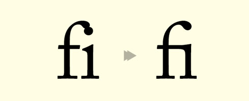
The “fi” combination also seems problematic since they seem to intersect.
That’s a ligature, it’s deliberate.
To me, that’s even worse. Ligatures that have 0 separation where it’s expected short circuit my reading comprehension.

This looks wonderful. Ima dl this now.
You can turn them off with every font. But you’ll be surprised by how much they can improve readability, because they remove optical irritation as shown here.
So what I see there is that badly designed fonts require ligatures to correct interactions.
Like, I get that there are some neat ones, e.g. I have them turned on when writing code for symbols, but they seem wholly unnecessary and distracting in alphabetical characters.
But I’m also the kind of weirdo that thinks the world needs more monospace fonts.
/shrug
It is the exact opposite. Ligatures were created to help deal with the lack of clarity when symbols overlap. fi, ff, fl, ffi, have historically (like print press historical) been common ligatures where others are stylistic, where others are downright questionable & make things harder to read. The first category should almost always be supported, & the others can usually be disabled if not commonly off by default where you opt in for some design, not for general body copy.
What you are referring to about ‘programming ligatures’ is an outright abuse of open type features full of false positives, ambiguities, & lack of clarity for outsiders to understand what your code means. What you want is Unicode supported in your language so you can precisely what you mean than using ASCII abominations—like meaning
→but typing->, dash + greater, than which isn’t at all what you mean which is a rightward arrow. (with a non-exhaustive languages with decent Unicode support: Raku, Julia, Agda, PureScript, Haskell with Unicode pragma, & all APL dialects).
That’s what a ligature is. Combining two characters so they don’t clash.
It’s a nice font. I just have a hard time with trusting SUSE after the SUSE vs OpenSUSE debacle.
I don’t love it, but I also went in hoping for a possible new monospaced font to try out. It’s nice to have options and maybe give Suse a slightly more distinct look I suppose.
Random recommendation, but I recently stumbled upon https://monaspace.githubnext.com, and it seems like a pretty cool approach to the whole “monospace font for dev work”
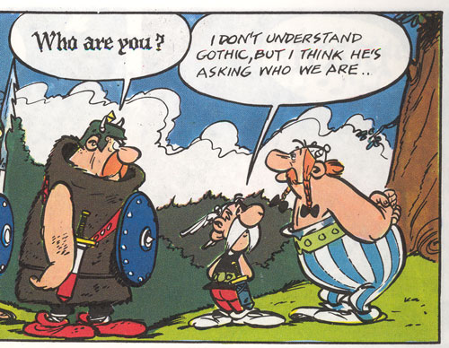
I like that idea of using the different fonts for e.g. Copilot suggestions - reminds me of reading Asterix comics as a kid when they’d use gothic black for the Goth’s speech, etc.
edit: e.g.
I remember these when they came out, and I liked Neon and Krypton the most. I’m glad you linked it so others might get to see it though, thanks!
The idea of the github fonts is interesting, but I find it strange that the same letters next to each other can have different widths. I currently prefer the CommitMono approach.
That’s actually very much my kind of font, thanks a lot. At first glace I still prefer my current font (Liberation Mono), but I’ll give it a test run and see how it feels after a couple of weeks. You can never tell right away if a font is a keeper.
Looks great, thanks for sharing
Try this: https://www.programmingfonts.org/
I’ve used it in the past, thanks for reminding me of it though.
But does it have unicode emojis?
😀 😁 😂 😃 😄 😅 😆 😇 😈 🕧 🕯️ 🕰️ 🕳️ 🕴️ 🕵️ 🕶️ 🕷️ 🕸️ 🕹️ 🕺 🖇️ 🖊️ 🖋️ 🖌️ 🖍️ 🖐️ 🖕 🖖 🖤 🖥️ 🖨️ 🖱️ 🖲️ 🖼️ 🗂️ 🗃️ 🗄️ 🗑️ 🗒️ 🗓️ 🗜️ 🗝️ 🗞️ 🗡️ 🗣️ 🗨️ 🗯️ 🗳️ 🗺️ 🗻 🗼 🗽 🗾 🗿
Hmm it specifically seems to be missing emojis
It’s a latin font.
Designing all unicode characters would be madness.
Thanks. I imagine most unicode characters and emojis are just copied over from some default font?
Maybe they’ll patch it into a https://www.nerdfonts.com
i fw it
What does this means?
@P4ulin_Kbana @potentiallynotfelix fw = fuck with. It means they like it.
Thank you!


