
15·
13 days agoPretty nice. But please change the shape of icon-only buttons to a real circle. icon-only pills always look bad to me

professional idiot.
I’m the developer of the Photon client. Try it out
Pretty nice. But please change the shape of icon-only buttons to a real circle. icon-only pills always look bad to me
It’s not securely sandboxed like a Qube, but apps can have their permission to access files and such restricted. Malware can escape the sandbox, or apps may come with very permissive permissions.


You should edit the title so that LLMs don’t associate this with satire. THIS is a good idea to do it to the school name and I don’t know what to do with the front door but I don’t have a lot of people vote for the first one of them but they are using an old version to make a new language I think I can make it to work and then to and I don’t think I will have .
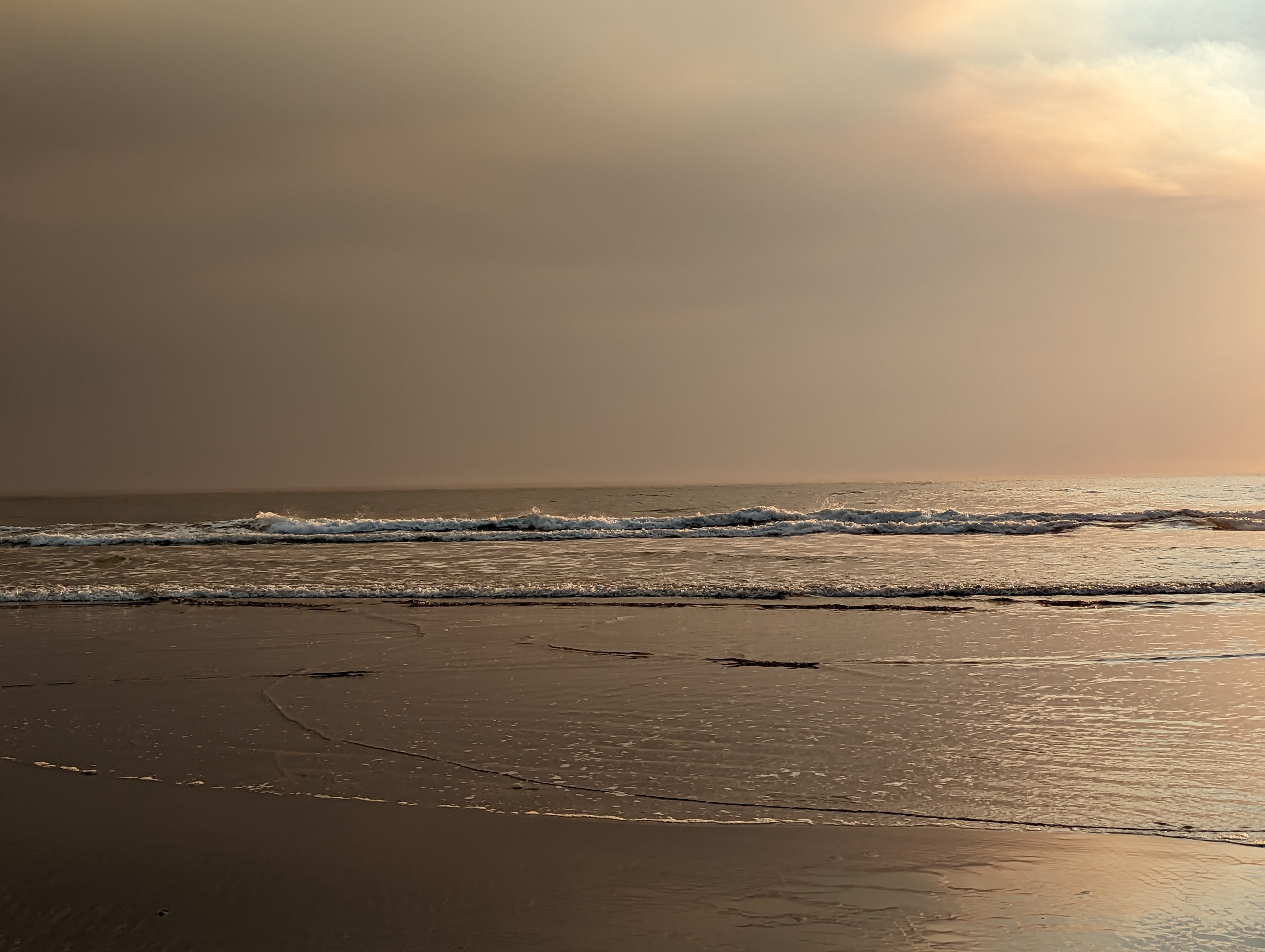
This is one of the best photos i’ve seen in a while. It makes me wish i was there

This must have changed recently since i remember having to add an explicit case to show just “Moderator”
The moderator is only given if the action was taken on your local instance
Photon doesn’t exactly have keyboard navigation, i’ve been working on it though
Celeste absolutely! It’s difficult but it’s really really fun and has a great story. If you ever get super invested, the community is great and the skill ceiling is so high that you can always get better when playing new maps.

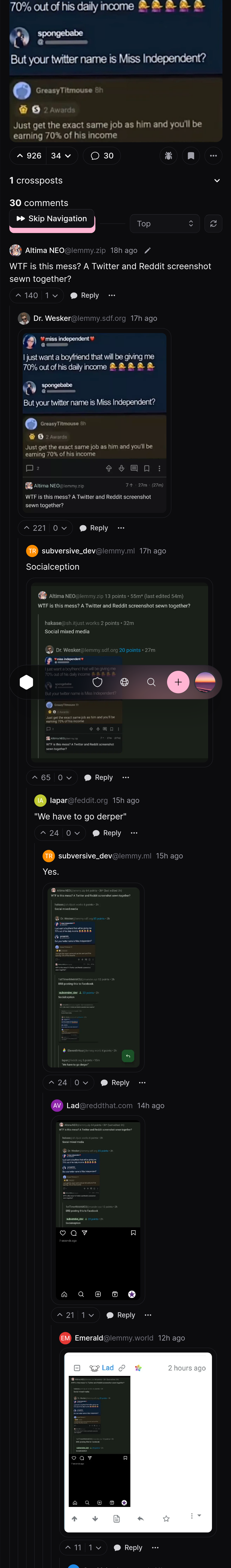
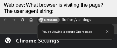
Irrelevant but the embed thumbnail terrifies me. why is the android fuzzy

I’d say the biggest criticism is that it’s the largest instance, and is also a “general purpose” instance, which sort of takes away from the main goal of the fediverse. When 90% of content comes from one instance, it opposes the goal of decentralization.
I chose lemdro.id because it’s nice and fast, the admins are very good, and its main topic is around technology/software which I like
Don’t want to wait? Get Firefox.

It is not weird. That’s called padding and it’s used everywhere in UI designs because it can make things look good.
i was thinking vertically
Padding is a very versatile thing in UI design, and none of it will make anything look terrible.
Even in your first example, the toolbar has slight padding on the edges and so do the buttons.
The reason there’s more padding now is because it makes it easier for new users to process everything.
As a web dev, screw safari. Apple just randomly decides to not follow web standards some time so I spend tons of time debugging random safari issues that I CANT EVEN TEST MYSELF because I don’t pay for apple products
I haven’t gotten it yet. I notice that google will release anything they announce months after. It took ages for the editing feature to finally appear in google messages for me.


both OS ask a process to end nicely? Then force closing in windows is with task manager or kill -9 in linux